Spreadsheet usage tips
Release Note: As of Concept v4.2, Excel has been replaced with a native Enventive Concept spreadsheet.
The integrated spreadsheet in Enventive Concept behaves similarly to Microsoft Excel. This section lists some of the notable differences between working with the Concept spreadsheet and working with Excel spreadsheets, as well as other tips about Concept's spreadsheet usage.
Accessing the Enventive menu options
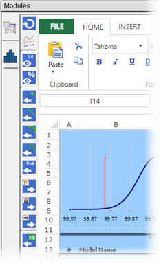
In Enventive Concept versions prior to v4.2, functions such as toggling between displaying criticality or sensitivity and exporting data as geometric objects were accessed using an "Enventive" right-click context menu in the Excel spreadsheet. Now, in Concept's integrated spreadsheet, these and other functions (including the ability to export to Excel) are found in a vertical toolbar on the left side of the spreadsheet.
Minimizing the spreadsheet ribbon
To minimize the spreadsheet ribbon, click the arrow icon located at the right end of the ribbon.
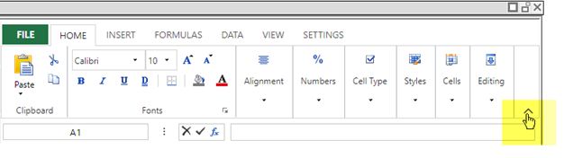
The ribbon will automatically return to its full size when you select any menu item. You can click the minimize arrow icon at any time to re-minimize the ribbon.
Controlling decimal display
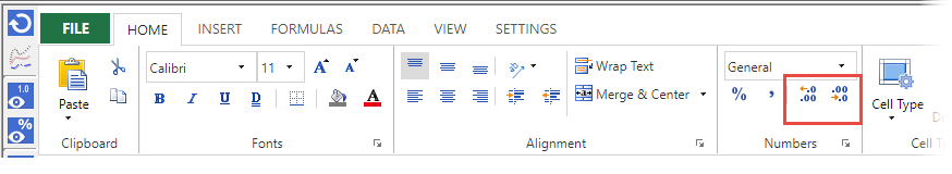
The Concept spreadsheet lets you control decimal precision using the increase/decrease options in the Home tab's "Numbers" ribbon item, highlighted in the illustration below.
These decimal precision controls work in the same way as they do in Excel's "Number" ribbon item: to change the decimal precision for a selected cell, you simply click on the increase/decrease icons. However, the Concept spreadsheet's editable cells (those with a yellow fill) are set to the "General" format, which does not allow decimal control. Excel automatically changes the cell format if needed when using the decimal precision controls, but the Concept spreadsheet does not include this capability.
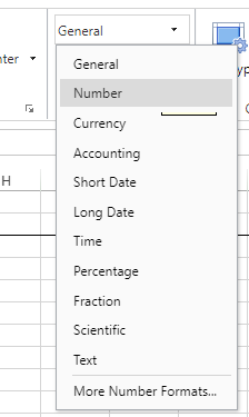
To change the decimal precision for cells with the "General" format, you must first manually change the format to one of the number formats (for example, Number, Percentage, etc.), as illustrated below.
Adding rows and columns
While Excel has "infinite" rows and columns, you must add rows and/or columns to the Enventive Concept spreadsheet when needed.
To change the number of rows and columns in the Concept spreadsheet:
-
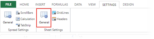
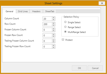
In the spreadsheet ribbon, open the Settings tab, and select “General” from the Sheet Settings group.
-
In the dialog that appears, edit the Column Count and Row Count fields to accommodate the number of columns and rows you need.
Charts
For tips on working with charts in the Concept spreadsheet, see the following sections.
Creating plots
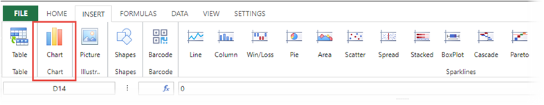
When creating plots, be sure to use the options under the Chart group, highlighted in red in the illustration below, instead of using the Sparklines group options shown at the right of the illustration.
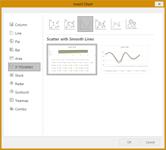
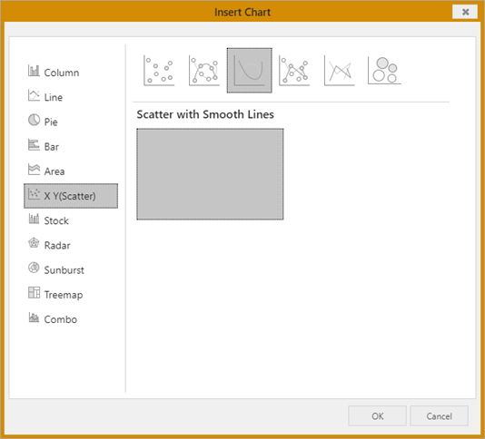
The spreadsheet's Chart group lets you select the type of plot to create. For example, the “X Y (Scatter)” option, shown in the illustration below, is typically used to create Tolerance-In-Motion (TIM) plots. (See "Using spreadsheets to create plots" in the Enventive Concept Quick Start Tutorial for a detailed example of creating a plot from TIM results.)
To plot spreadsheet data:
- Select the columns of data that you want to plot. Hold down the Ctrl or Shift key to select multiple columns.
-
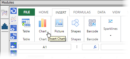
From the Spreadsheet view ribbon, select Chart from the Insert ribbon item to open the chart wizard.
-
The Insert Chart dialog opens to let you select the format of the chart. (Note: You may need to increase the size of the spreadsheet view to see the entire Insert Chart dialog.)
After selecting the desired format, click OK to create the chart. The chart is inserted into the spreadsheet.
-
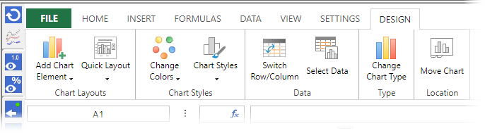
After inserting the chart, you can use the options under the Design tab in the ribbon to format the chart as desired. (Note that the Design tab does not appear in the ribbon until the chart is created.)
Editing a chart title
To edit a chart's title:
-
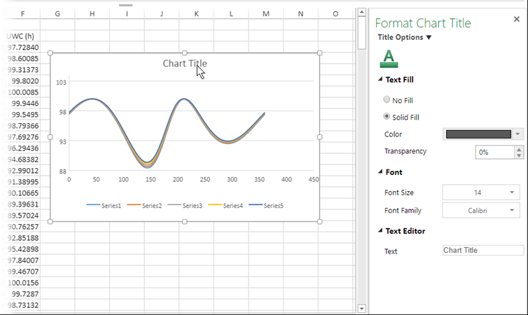
Double-click on the chart's title area (or right-click and select Format Chart Title) to open the Format Chart Title dialog.
-
In the Text Editor section at the bottom of the Format Chart Title dialog, enter the text that you want to appear as the chart title.
-
You can also change the formatting for the chart title, such as the color and font used for the text.
Adding and editing chart axis titles
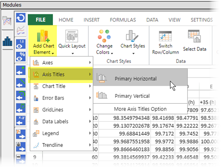
If your chart does not yet have axis titles (labels), you can add them using Add Chart Element > Axis Titles from the spreadsheet ribbon:
To modify an axis title:
-
Double-click on the axis title in the chart (or right-click and select Format Axis) to open the Format Axis dialog.
-
Under Title Options, select the horizontal or vertical axis title option and edit the text that displays under the Text Editor section of the Format Axis dialog.
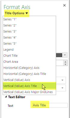
-
In the Text Editor section at the bottom of the Format Axis dialog, enter the text that you want to appear as the axis title.
-
You can also change the formatting for the axis title, such as the color and font used for the text.
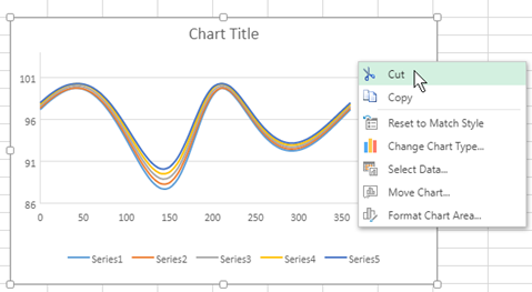
Deleting charts
The Concept spreadsheet does not support deleting a chart using the Delete key, as Excel does. To delete a chart in a Concept spreadsheet, right-click on the chart and select Cut from the right-click menu.
Known issues
The Enventive Concept spreadsheet has the known issues with chart functionality detailed below.
Chart preview not displaying
When creating a chart (Insert > Chart), the preview panes in the Insert Chart dialog normally look similar to the following illustration.
When drag-select or extend-select is used to select a block of cells for creating a chart, and the selection exceeds 32 rows, the preview images do not display in the Insert Chart dialog. Instead, one of the preview panes is grayed out and the other is not visible, as shown in the illustration below.
This is only an issue with the preview display; the chart can still be created.
If you hover over the area where the preview pane should be visible, the preview pane appears but is grayed out. You can select the pane and click OK to create the chart.
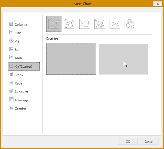
Note that this issue does not occur when the selected block of cells does not exceed 32 rows, or when data is selected using drag-select on column headings (A, B, C, etc.), regardless of number of rows included in the selection.
Incorrect X axis (ordinal axis) labeling
Release Note: This issue has been fixed in Concept v4.4.1.
When creating a chart (Insert > Chart), if the first cell in the range of values for the x axis is a zero, the chart may use the row numbers for labeling the x axis instead of using the range of values. This issue occurs because the zero value in the first cell is being treated as an alphanumeric value rather than a numeric value.
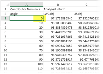
To work around this issue, type -0 in the cell that contains the zero value. This transforms the value to a numeric value and automatically corrects the X-axis labeling.